

works
実績
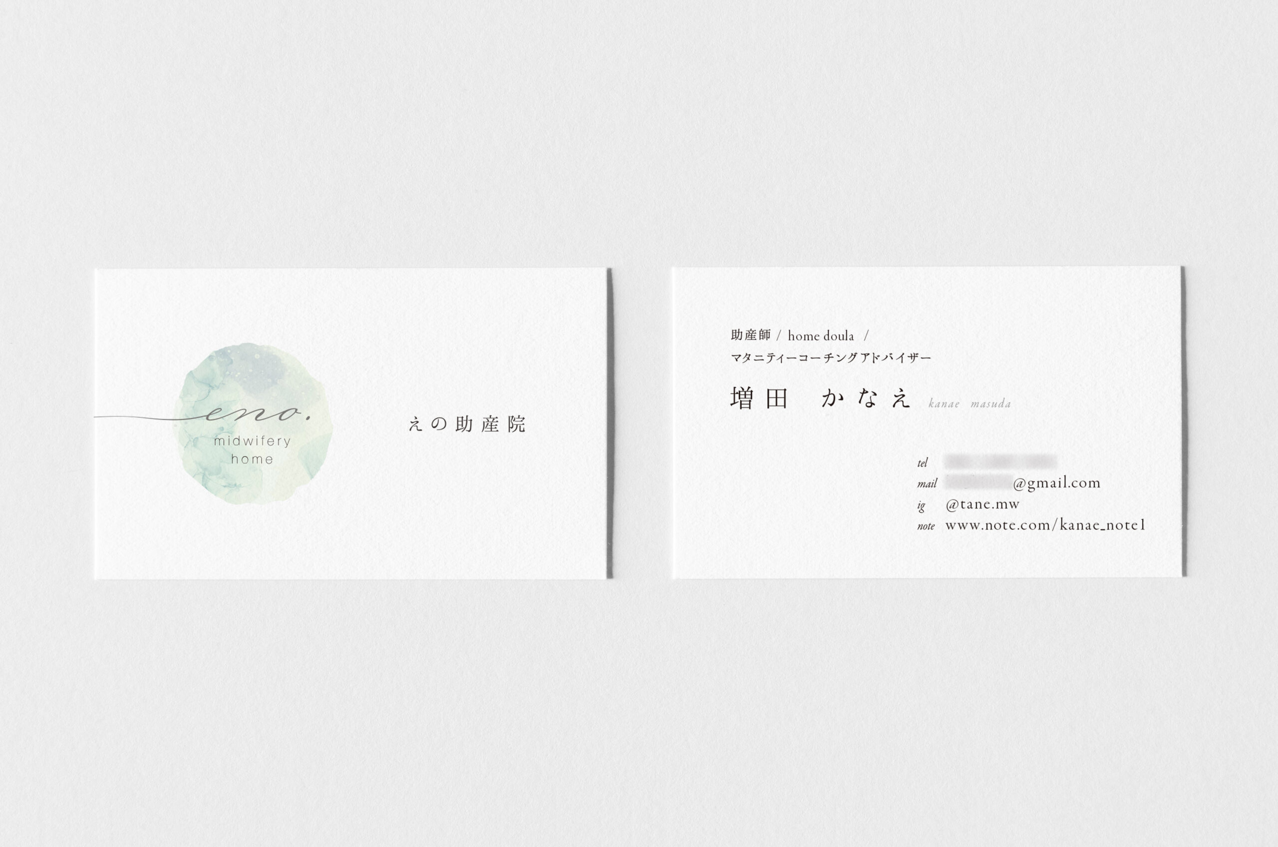
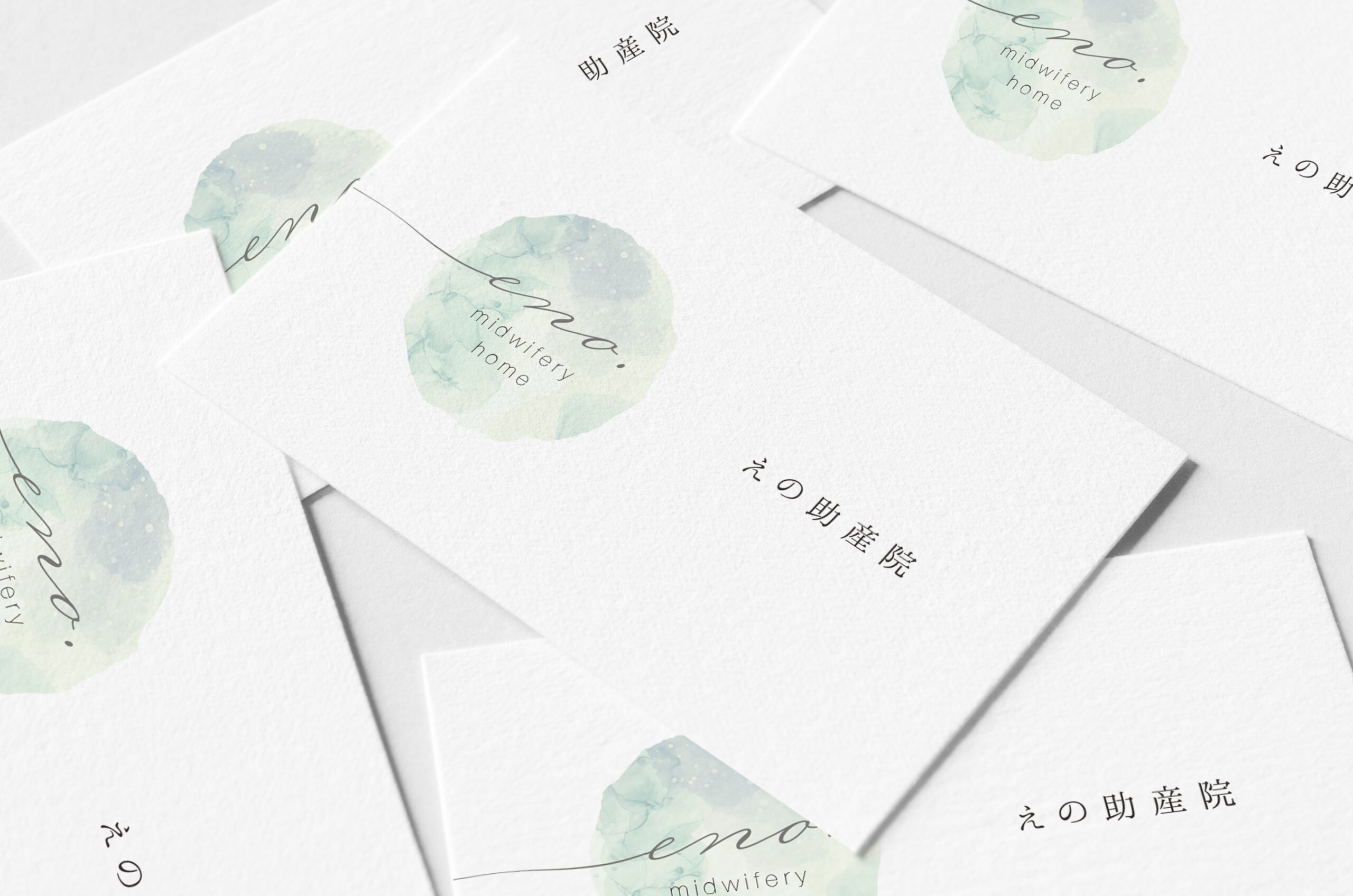
We handled the logo branding for a midwifery clinic.
We proposed a visual that combines the image of the moon, which is closely related to childbirth, with the symbol “〜,” which is part of the origin of “eno.” The colors are soft and reminiscent of amniotic fluid, evoking images of the moon and the round belly of a pregnant woman. Coincidentally, the logo mark also resembles the moment a fertilized egg is conceived.