
works
実績
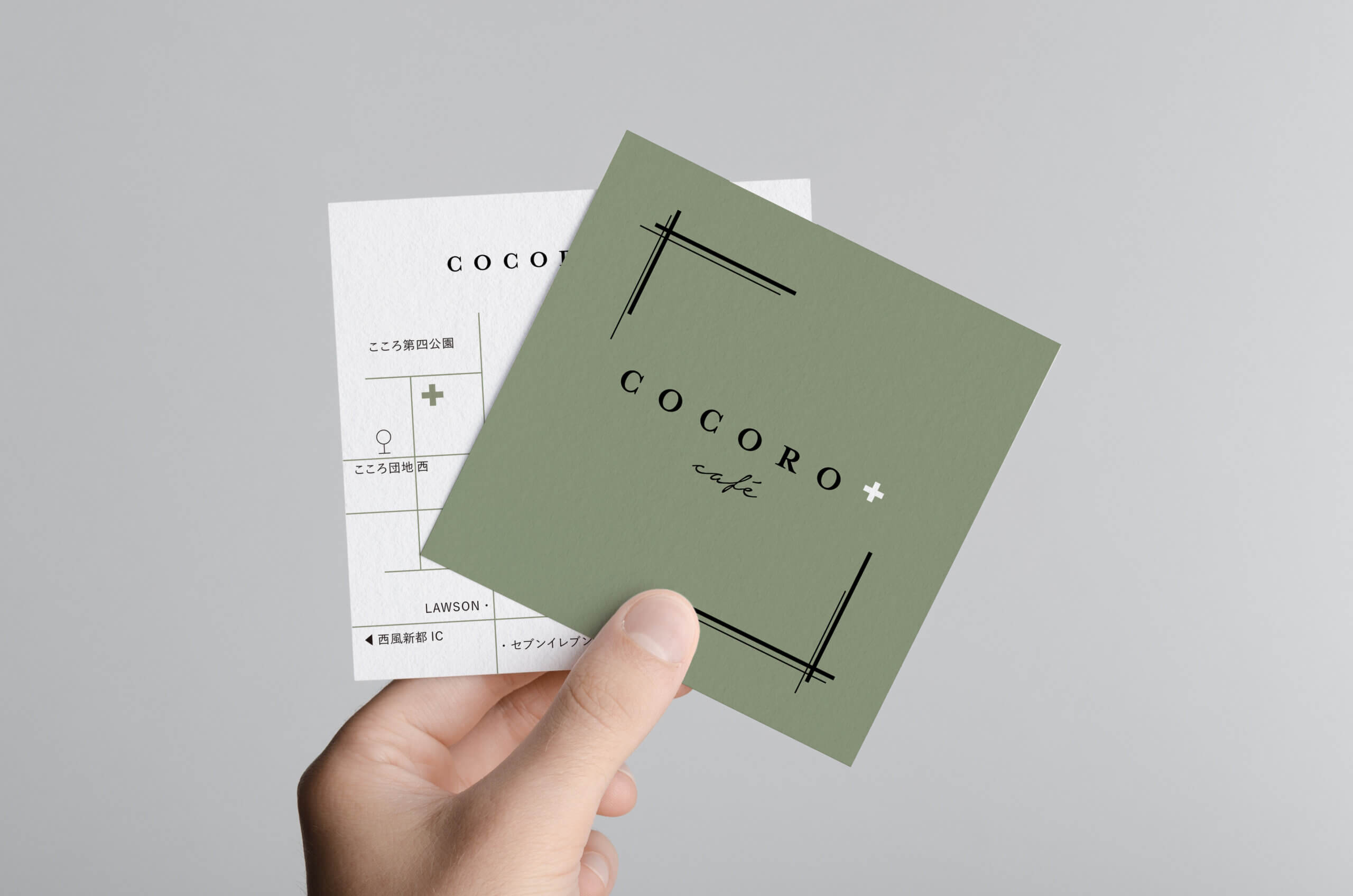
We created the logo branding for Kokoro Plus Cafe, a detached cafe located in a corner of the Nishifu Shinto Kokoro housing complex in Hiroshima.
The concept color is moss green, evoking the image of a garden surrounded by trees, and the logotype is in a classical font. The white plus sign (+) and brackets in the logo symbolize “plus,” aligning with the cafe’s concept: “May this be a place that enriches the lives and hearts of our customers.” The owner and staff carefully considered various patterns, and the final logo mark was chosen with great sentiment.
See COCORO+café Instagram here.